Accessibility
A brief overview of accessibility in web design, to what degree the RSpace product meets the industry standards, and what we are doing to continually improve.
Overview
Ensuring that everyone has equal access to RSpace is important to us, and to that end we are working continuously to improve the accessibility of the product. This article provides a brief overview of the current state of accessibility support in RSpace, current work in improving accessibility, and notable accessibility features in the interface.
If you ever experience any issues with using RSpace, please don’t hesitate to reach out to support or to raise an issue on GitHub. The more information we have about how these changes impact on those who rely on them, then the better we can make the software!
WCAG Accessibility Self-Assessment
A self-assessment of RSpace's compliance with the Web Content Accessibility Guidelines (WCAG) 2.2 was undertaken in June 2025, and was last updated September 2025. You can download the document here: rspace_accessibility.pdf
While this report is not equivalent to a comprehensive professional audit, it provides a good initial evaluation of our accessibility support, and we are working to improve on the criteria that we do not or only partially meet.
Current work
RSpace is currently undergoing a major refactor of its interface, which aims to both standardise and improve the general user experience, make the product more mobile-friendly, and greatly improve accessibility of the older parts of the product.
This can be seen in how the Gallery and Inventory, which have been ported to a more modern interface technology, score better in the WCAG self-assessment provided above compared to the Workspace & Document Editor, which we are in the process of modernising. It is now also easier to support additional accessibility features in the Gallery and Inventory now that they've been modernised.
Noteworthy functionality
There are some aspects of the interface that we’ve been particularly focused on, having identified them as being key to the efficient use of the product, which is largely concerned with data entry and retrieval. Many of these aspects focus on the visual parts of the interface and input devices. The following aspects do not require opt-in and are changes we're making more broadly to how the product is presented and can be interacted with. We then detail a few additional features that are opt-in, for those who would like to use them.
No opt-in needed
- To aid those with colour blindness, we are ensuring that no information is solely conveyed with colour alone: there will always been a textual label or an icon. Where we are using colour, it is simply for stylistic effect, or to convey information that is still presented in other ways. Thus far, it has not proved necessary to provide a colour-blind-friendly theme but is something we would consider if simply tweaking the design proves insufficient.
- In a similar vein, we have also been making sure that all interface elements have sufficient contrast, in particular where small text sits atop a similarly-coloured background. The WCAG standard provides numeric bounds that can be easily computed so this has been part of our effort to automate our compliance with the standards.
- When it comes to input, we are adding more keyboard controls to the interface, which is also of benefit to power users. It is also vital that the standard browser controls, like tab, space, enter, and the arrow keys work as expected in all scenarios.
- Lastly, we’re also aiming to provide full compatibility with accessibility technologies such as screen readers and braille keyboards wherever possible. This is achieved by providing alt-text for images, meaningful link text, and correct cascading headings. This will require some of the most substantial changes as files, thumbnails, and other images that are uploaded or edited within RSpace will all need to be annotated accordingly by the colleagues of the users of such tools.
Opt-in functionality
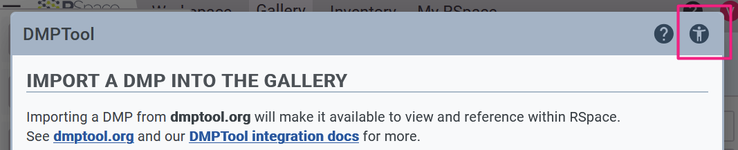
As for the features that require opting-in, look out for an accessibility icon on the top-right of pop-ups, which can be tapped to open additional information on features supported.
The following features adjust the interface based on browser or device settings.
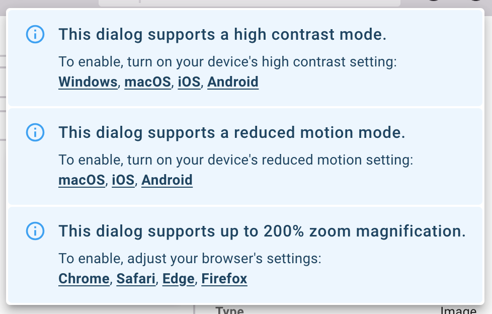
- High contrast mode simplifies colour used in the interface, increasing the contrast between text and its background, and between adjacent elements. This is to the benefit of those with poor eyesight, but also for anyone who finds themselves in a situation where glare from excess lighting makes using the product difficult. To enable, simply turn on a high contrast mode in your device’s settings, and RSpace will pick up that request on the next page load.
- Reduced animation mode turns off all animations: all animations in RSpace are superficial and are not necessary for the full use of the product, and so if they prove distracting or trigger any impairments, they can be turned off in your device’s settings.
- Zoom level: the parts of the product that meet the accessibility standard provide a high variability in supported zoom levels, allowing those with poor eyesight to expand the size of the interface. This is provided in concert with mobile-friendly views.
- Skip-to-content links: press tab after initially loading either Inventory or the Gallery to open up the skip-to-content menu which contains a few links that move the keyboard focus to significant landmarks on the page, bypassing the need to press tab over and over through the app bar and other structurally page elements.
How did we do?
Integrations / Apps List & Availability
Global IDs