Table of Contents
Toggle Inventory and Container Views 🧪
It is possible to toggle between different item views, based on which view suits your needs best or which one you prefer.
It is possible to toggle between different item views, based on which view suits your needs best or which one you prefer.
The available views are:
- List view shows the contents as a list, with global ID information
- Tree view enables you to navigate a nested hierarchy of items
- Card view is useful for viewing image, location, content, and modified details at a glance
- Grid view enables you to view items as located in a two-dimensional grid
- Visual view enables you to view items as located on an image
The different views are described in more detail below.
Toggling views
Left-hand panel
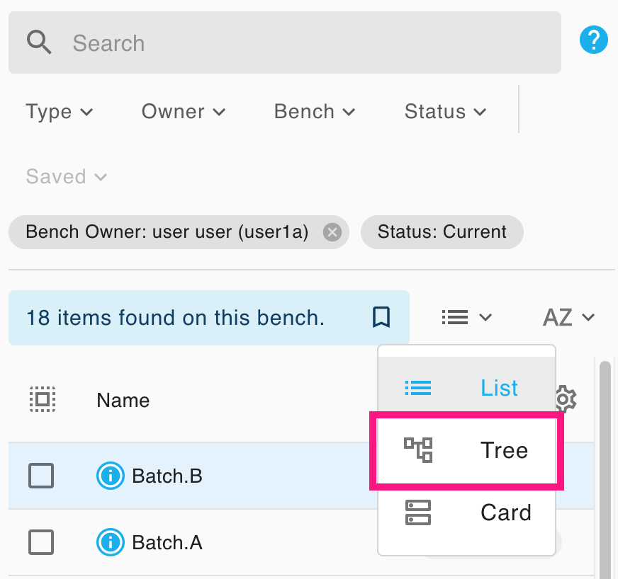
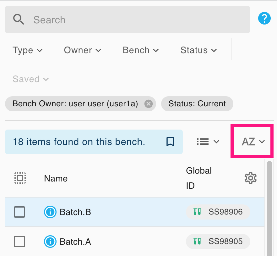
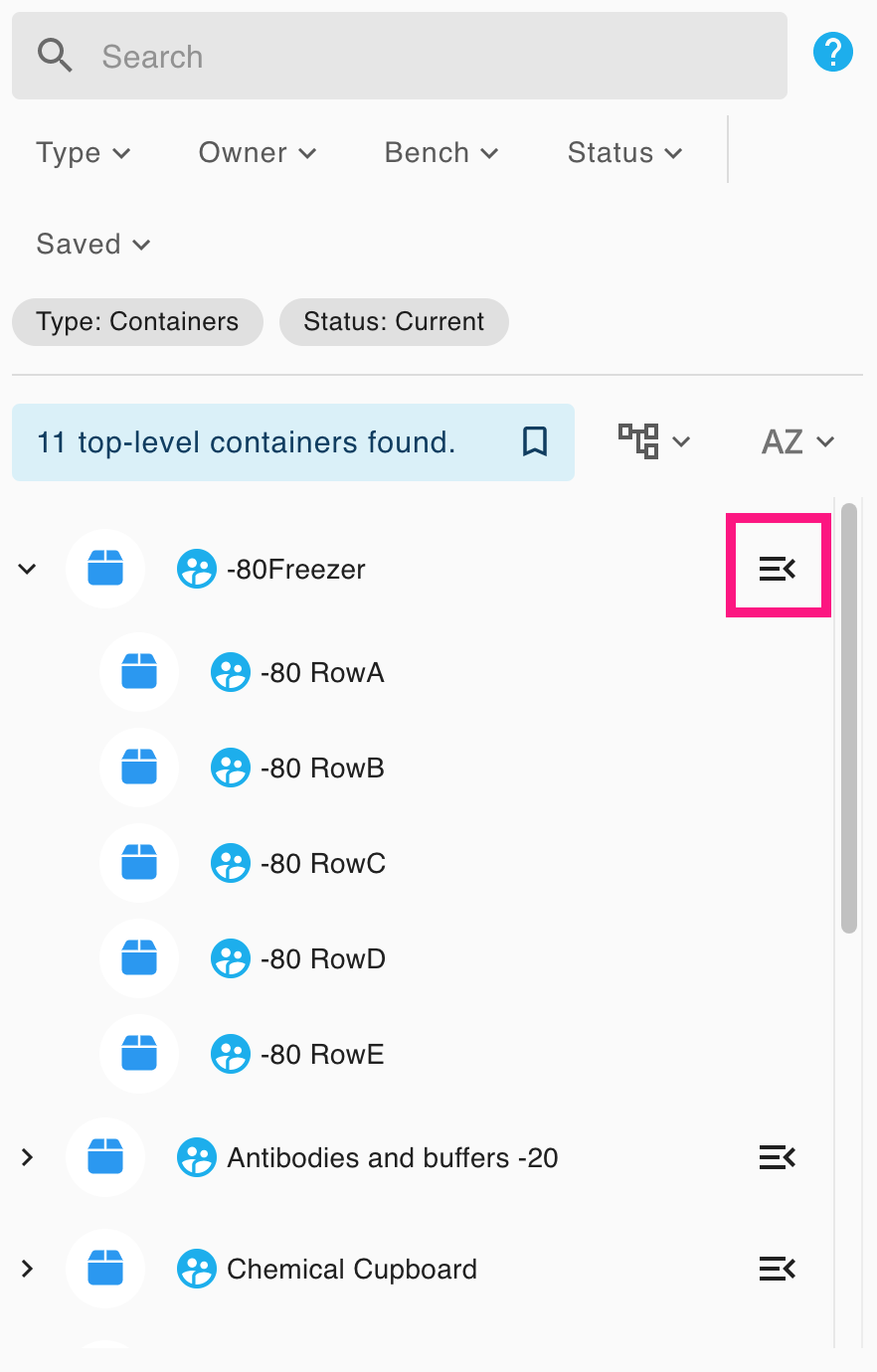
To change the view of the left-hand panel, use the view toggle button above the table:
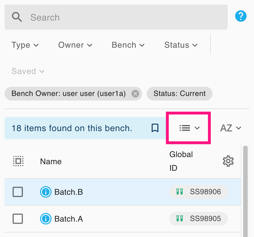
Then select a view:
Container
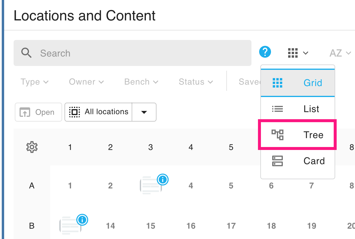
For containers, the view toggle button is under the Locations and Content section:
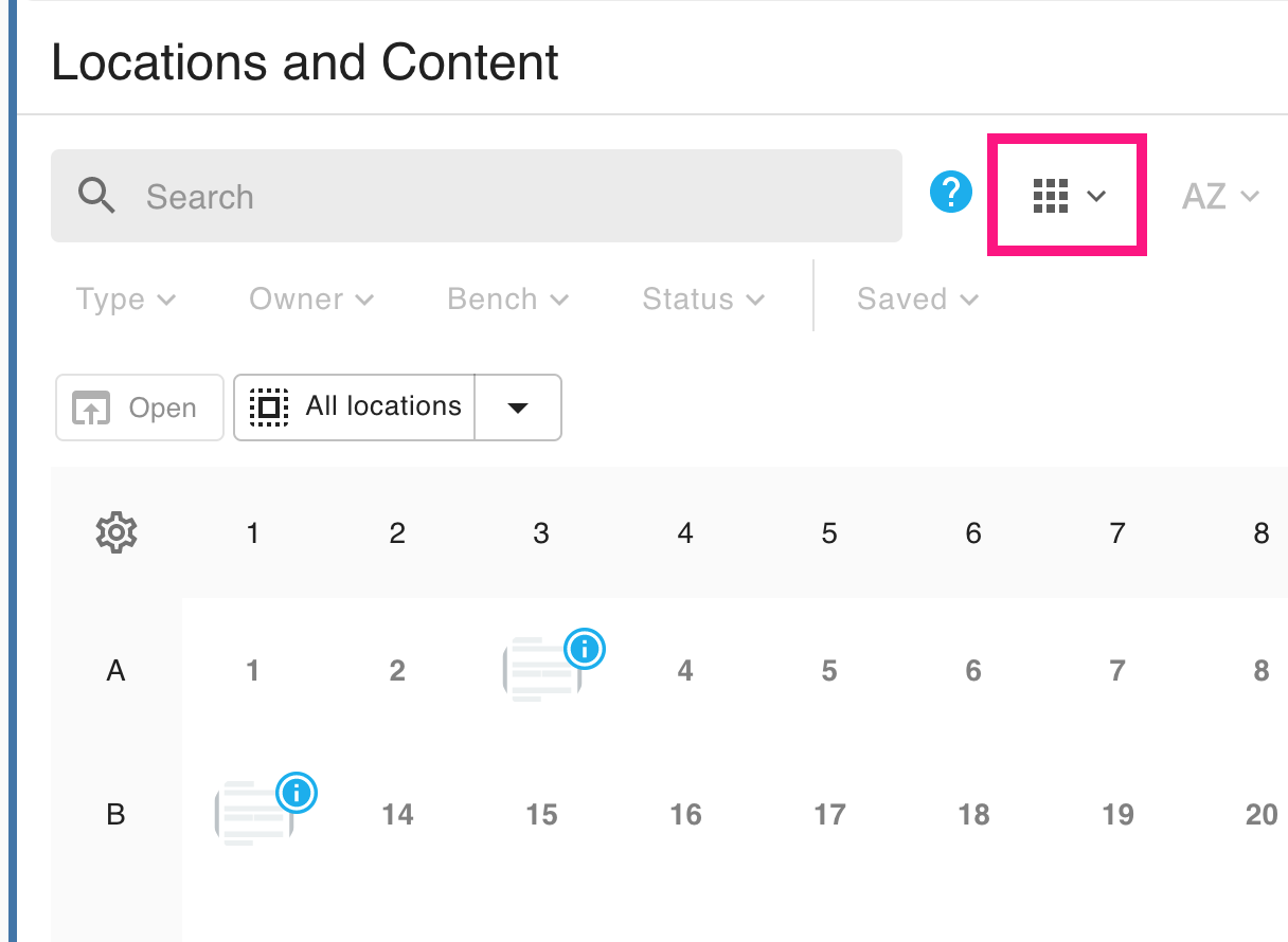
Then select a view:
Sorting and Filtering Options
You can sort and filter items in all views: read more about the various options at Search Inventory.
View types
The left-hand panel and all containers support list, tree, and card views.
Additionally, grid containers support grid view, and visual containers support visual view.
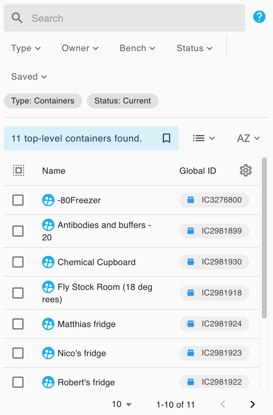
List
List view shows the contents as a list, with their global ID information. It is useful for performing bulk actions using the item checkboxes (see Edit an Inventory Item), and for viewing search results. The second column of list view is customisable: see Search Inventory.
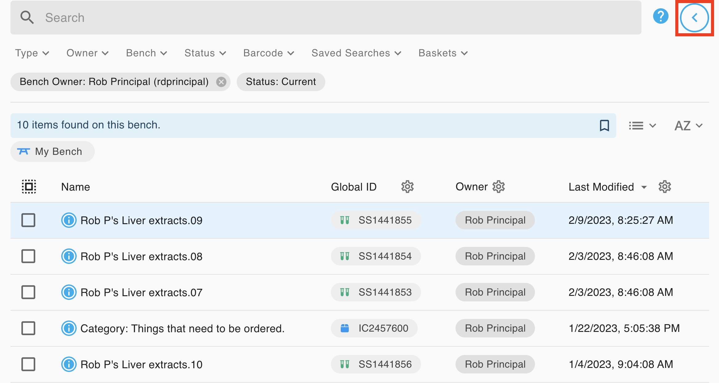
Expanded three column view
If you accessing the system with a computer, users can also enter an expanded list view using the icon at the top right. This can be used to toggle various panels into a wide mode that allows up to three selectable data columns to be viewed simultaneously.
Tree
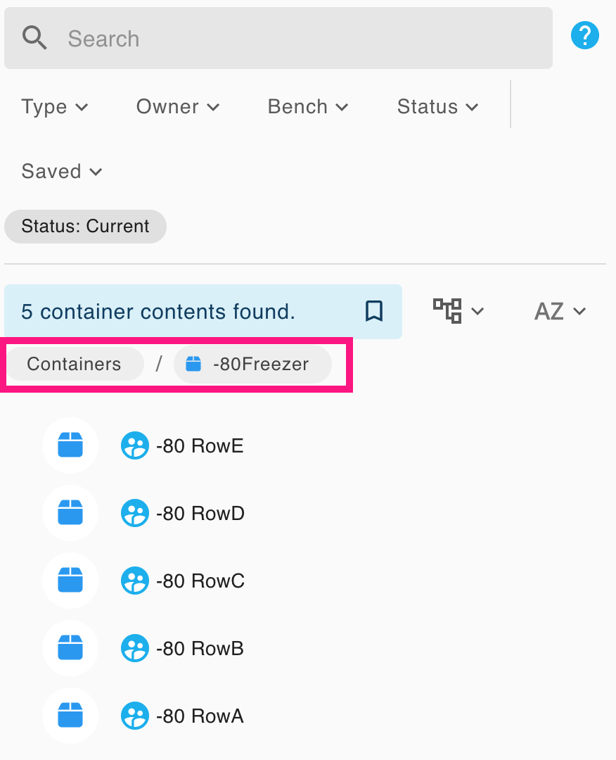
Tree view enables you to navigate a nested hierarchy of items. Click on a container to expand or collapse its contents; clicking on an item also opens it in the right-hand panel.
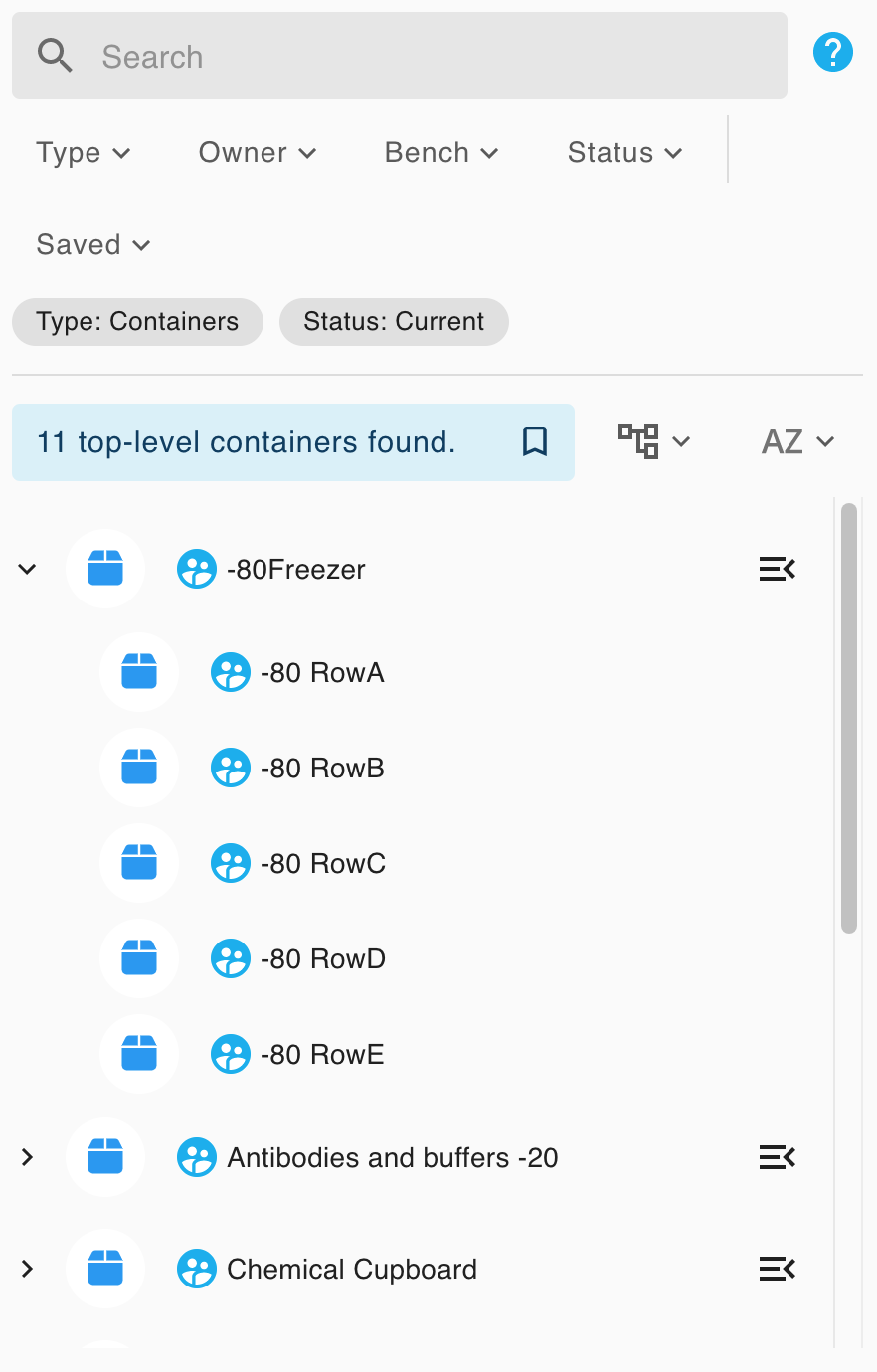
You can use the Navigate To Container button to zoom your view into that container's contents. You can then use the breadcrumbs to move up the container hierarchy.
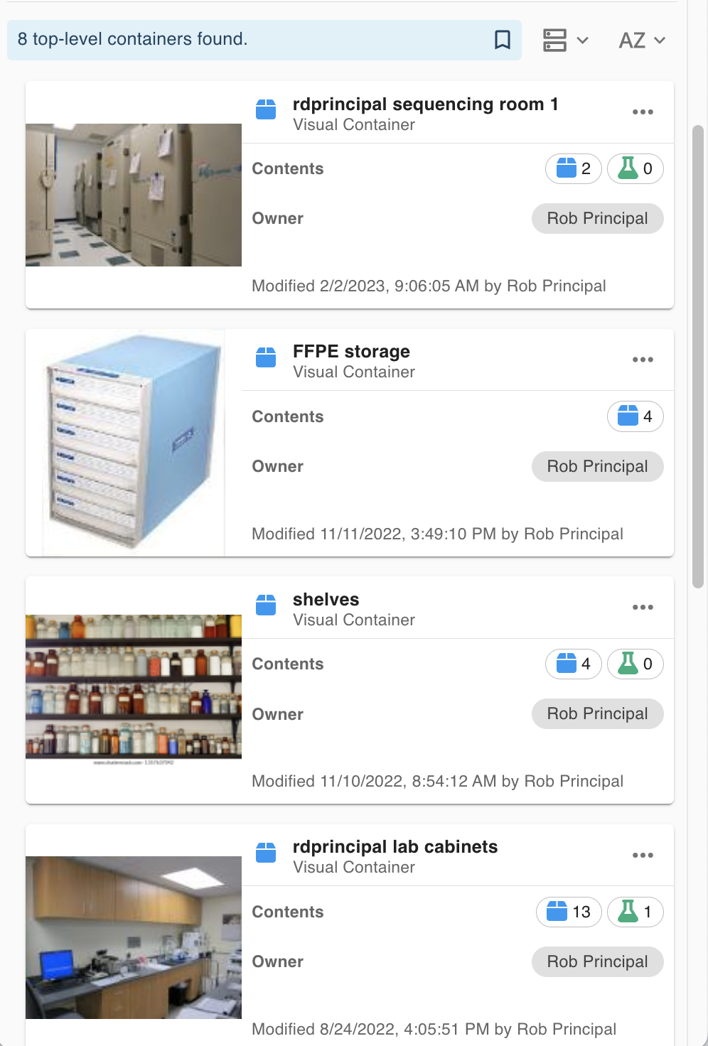
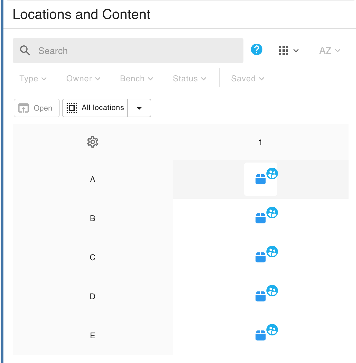
Card
Card view is useful for viewing image, location, content, owner, and modified details at a glance.
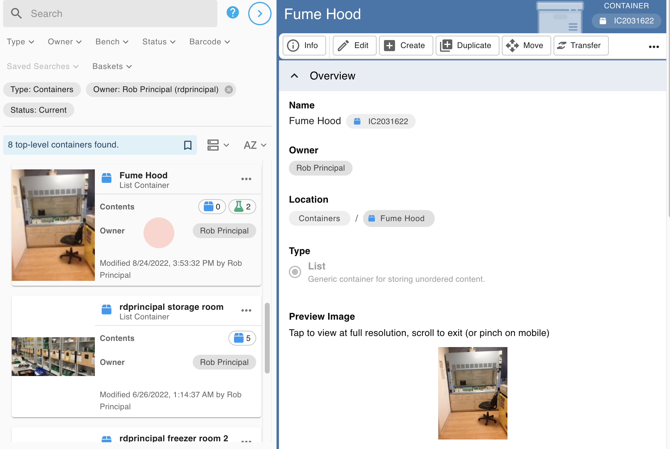
Clicking on a card when in three panel mode (e.g on a computer screen) displays more information for the item in the right-hand details panel:
On smaller device in one panel mode, (e.g a mobile phone), clicking or tapping the card will change the view to the details panel.
Click or tap on the preview image to see a larger view of the image.
Click or tap the three dots on the top-right of a card to access more options in the context menu.
Grid
Grid view is only available for grid containers. It enables you to view items as located in a two-dimensional grid. You can read more at Select Items in Inventory and Customise Axis Labels for Grid Containers.
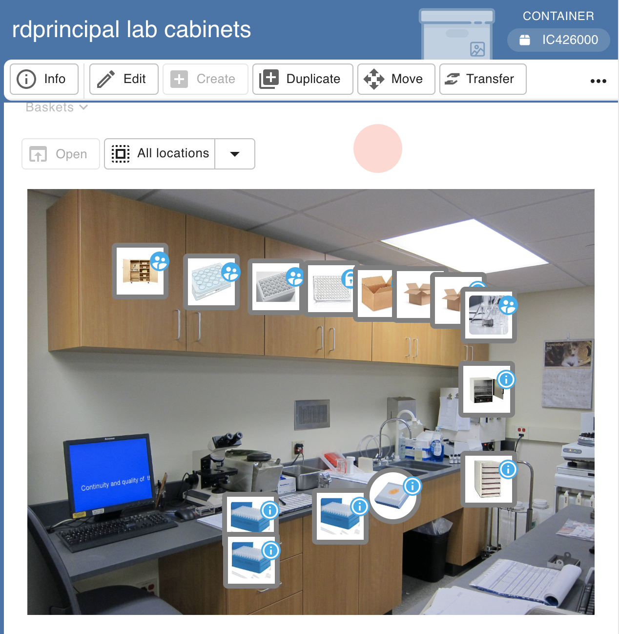
Visual
Visual view is only available for visual containers. It enables you to view items as "hot spots" located on an image. Mouseover the items to see more information or click to select them. You can read more at Select Items in Inventory.
How did we do?
Permissions and Sharing in Inventory 🧪
Scan, Use and Print Barcodes in Inventory 🧪